

IT`S ABOUT COLOR AND STEREOTYPE

This project examines color combinations, their use and disregard by expensive brands, based on the analysis of the finalists of the Red Dot Design Award and Designers Institute of New Zealand 2021-2022 design competitions. The project highlights the stereotype that premium products mostly wear black, dark or, on the contrary, bleached tones. Classification and analysis of 507 entries of a graphic design competition have been conducted. The study explores methods of conveying luxury, demonstrates the underestimated potential of color, its impact on differentiation and sales effectiveness, and seeks to deconstruct stereotypical thinking.

Selected samples with vibrant colors were examined to determine whether color can indeed work in high-end branding. The survey results confirm this in 6 out of 7 cases.

To determine which color combinations/ratios appear luxurious and which do not, 40 color samples were created and tested. They were divided into categories based on three of the most common color schemes from Itten's color wheel: Triadic, complementary, and analogous colors.

The combinations selected through testing:

According to the results, we can see that the analogous color scheme is most common (75%), The complementary method works three times less (25%) and triadic match doesn't work at all.

To break this stereotype, I decided to create a premium design using the color and merchandise of a low-price category in black and white tones.
____________________
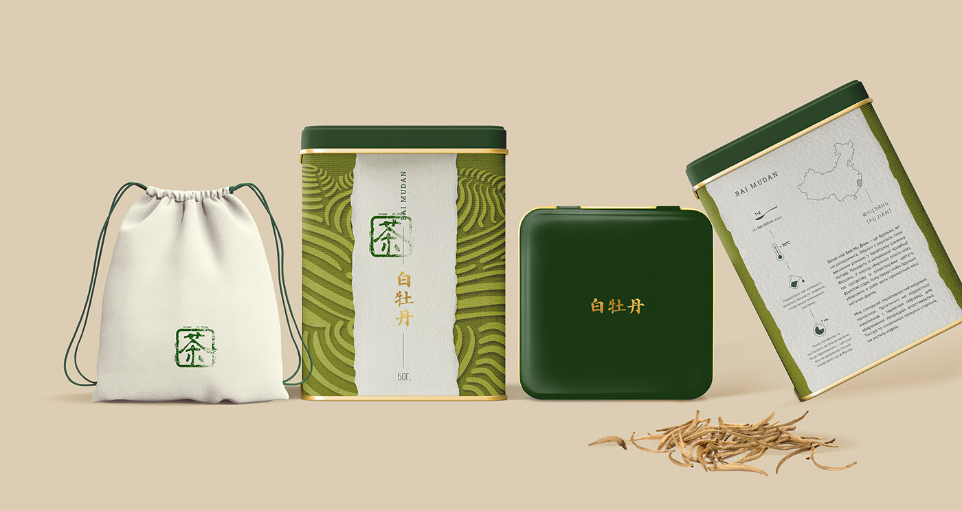
The first product is a set of white teas — Bai Mudan and Baihao Yinzhen — which are considered among the most expensive and beneficial due to minimal processing. White tea is harvested before the tea leaves fully open, when the young buds are still covered in fine white hairs, hence the name "white" tea. It is grown in the Fujian province and is intended for affluent individuals with stable incomes. The product should be stored only in tightly sealed containers to prevent exposure to direct sunlight and odors. Therefore, I decided to use a metal tin as packaging.
The inspiration for the pattern on the label came from Chinese tea plantations. Central symmetry was employed to convey discipline and tradition inherent in Chinese culture. The vertical text was chosen because traditionally Chinese was written from top to bottom. The gold accent elevates it to a more premium position and creates a sense of the morning sunrise, symbolizing the time of leaf picking.


_______________________________________________________________________
The next product is Broken Tea. It's a black, unpretentious tea designed for a young target audience (often students) who care about the environment, hence the packaging made from recycled materials. "Broken" refers to the grade of tea, consisting of broken and twisted leaves that steep quickly and have a strong infusion. The design is inspired by the "rubber hose" style of cartoons from the 1930s. Playful and simple at the same time.


